The image displays a document with an infographic featuring a blue line with circles and connecting dots spanning from 2007 to 2021, marking significant dates and events on a timeline. Each point on the line is annotated with a year and a brief description.

Trendreport

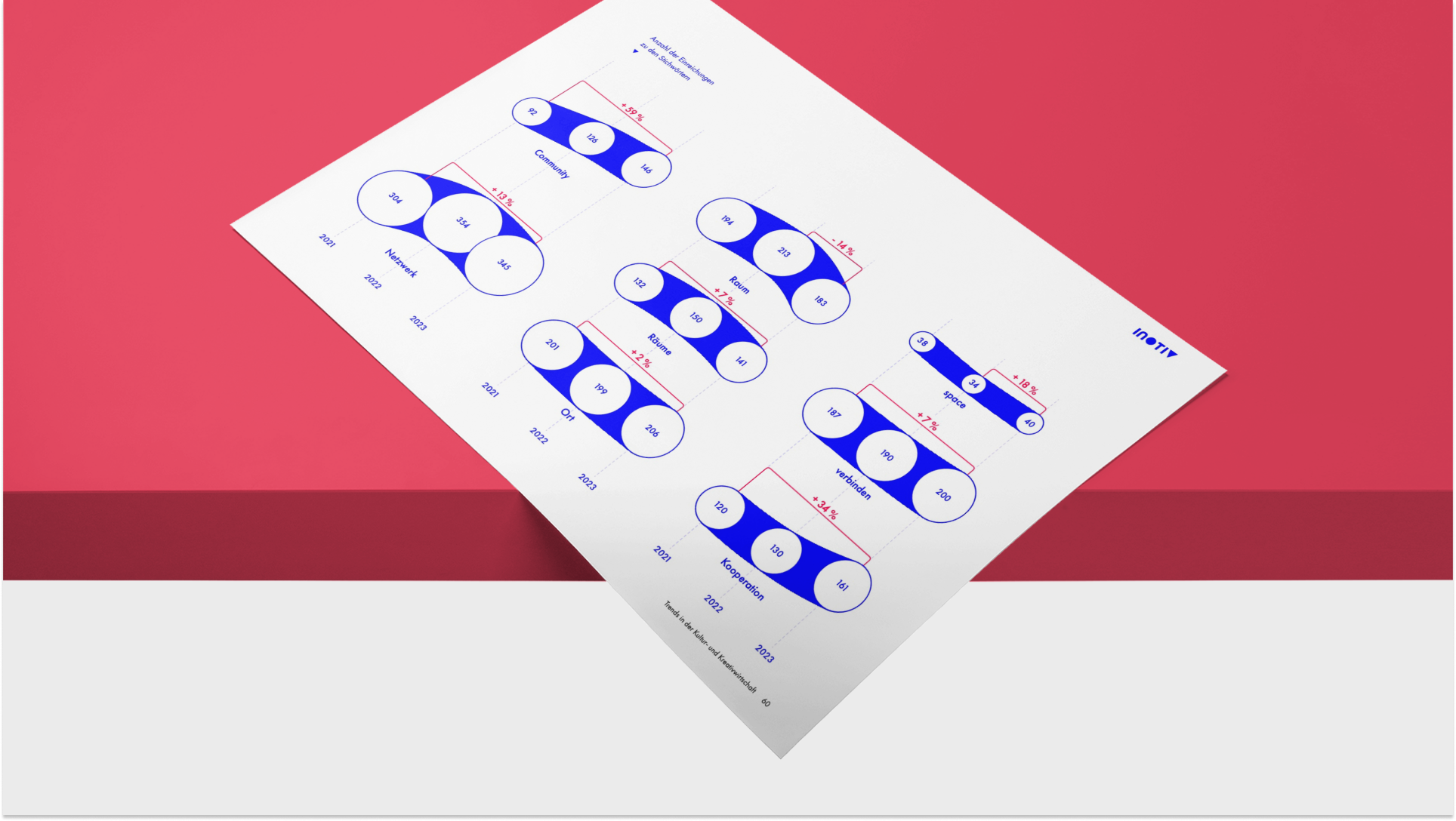
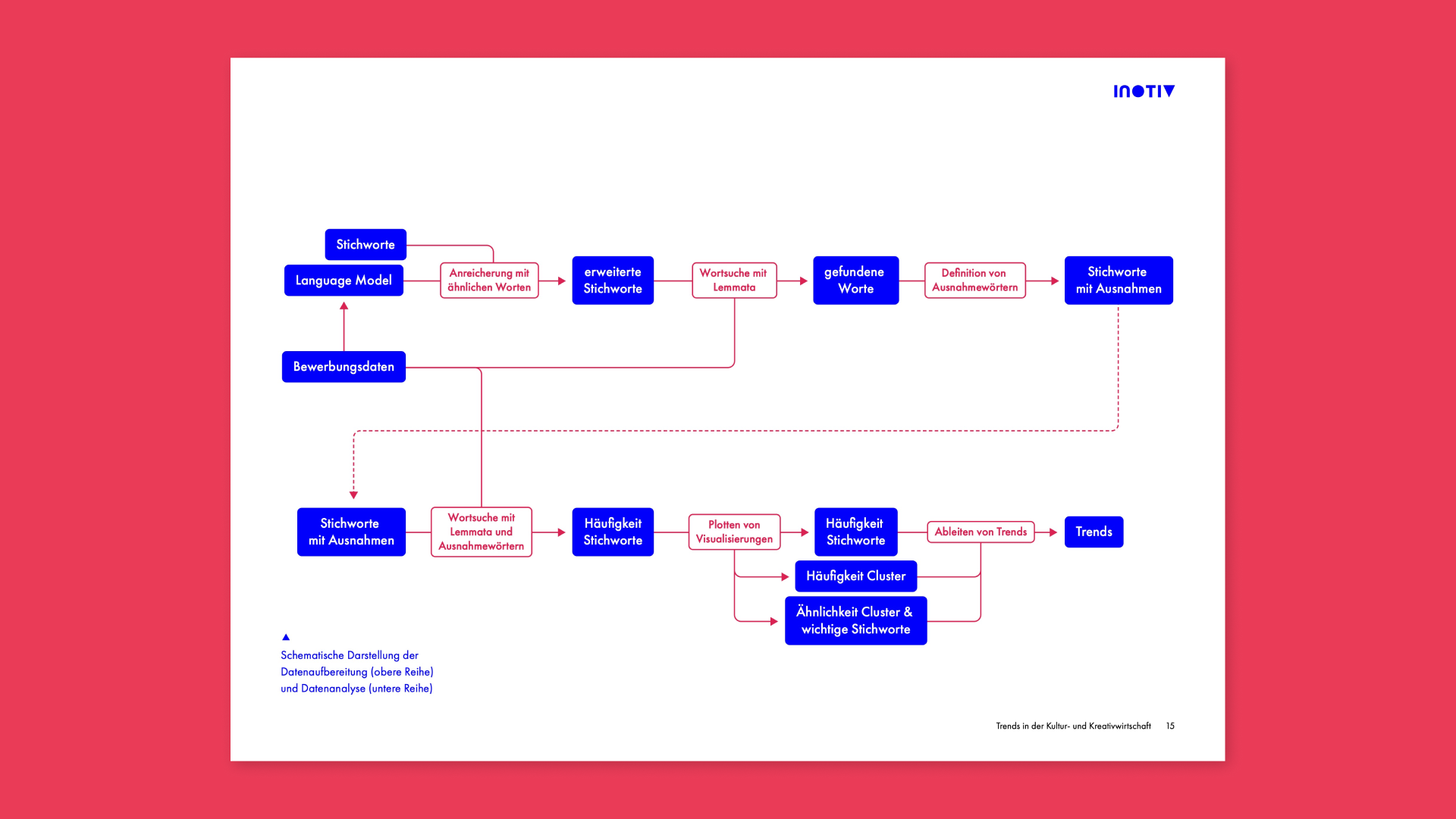
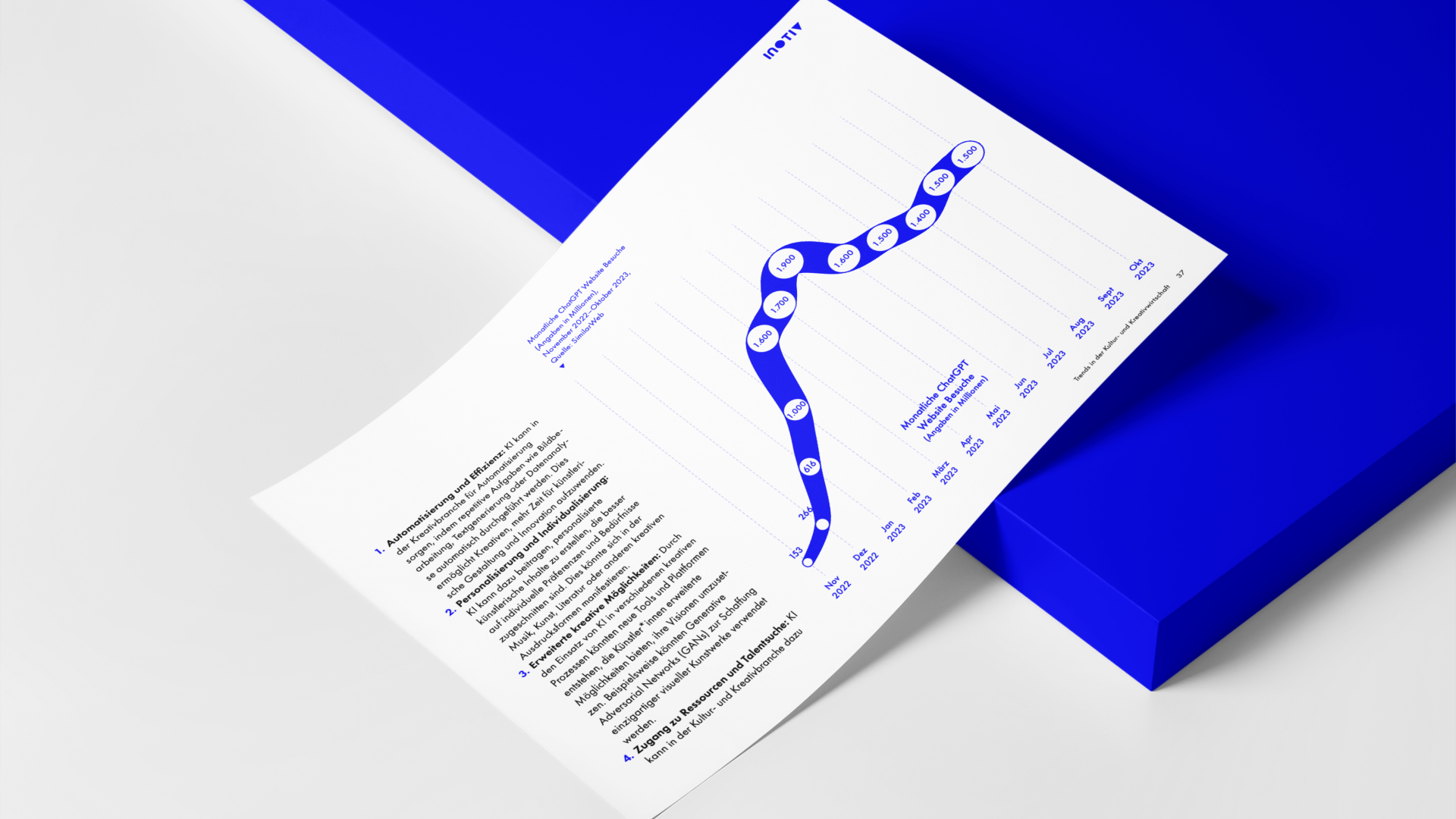
In the "Trendreport" project, we analyzed an extensive dataset of innovative business ideas, cleaned and operationalized the data, and conducted a deep analysis using AI and Python scripts. We uncovered relationships and generated extensive data, which we transformed into meaningful data visualizations and infographics.

Project features:

  • Report
  • Science
  • Data Visualization
Show AppTrendreport
The image displays a document with several infographics featuring blue lines with circles and connecting dots, marking significant dates and events on a timeline. Each point on the line is annotated with a year and a brief description.

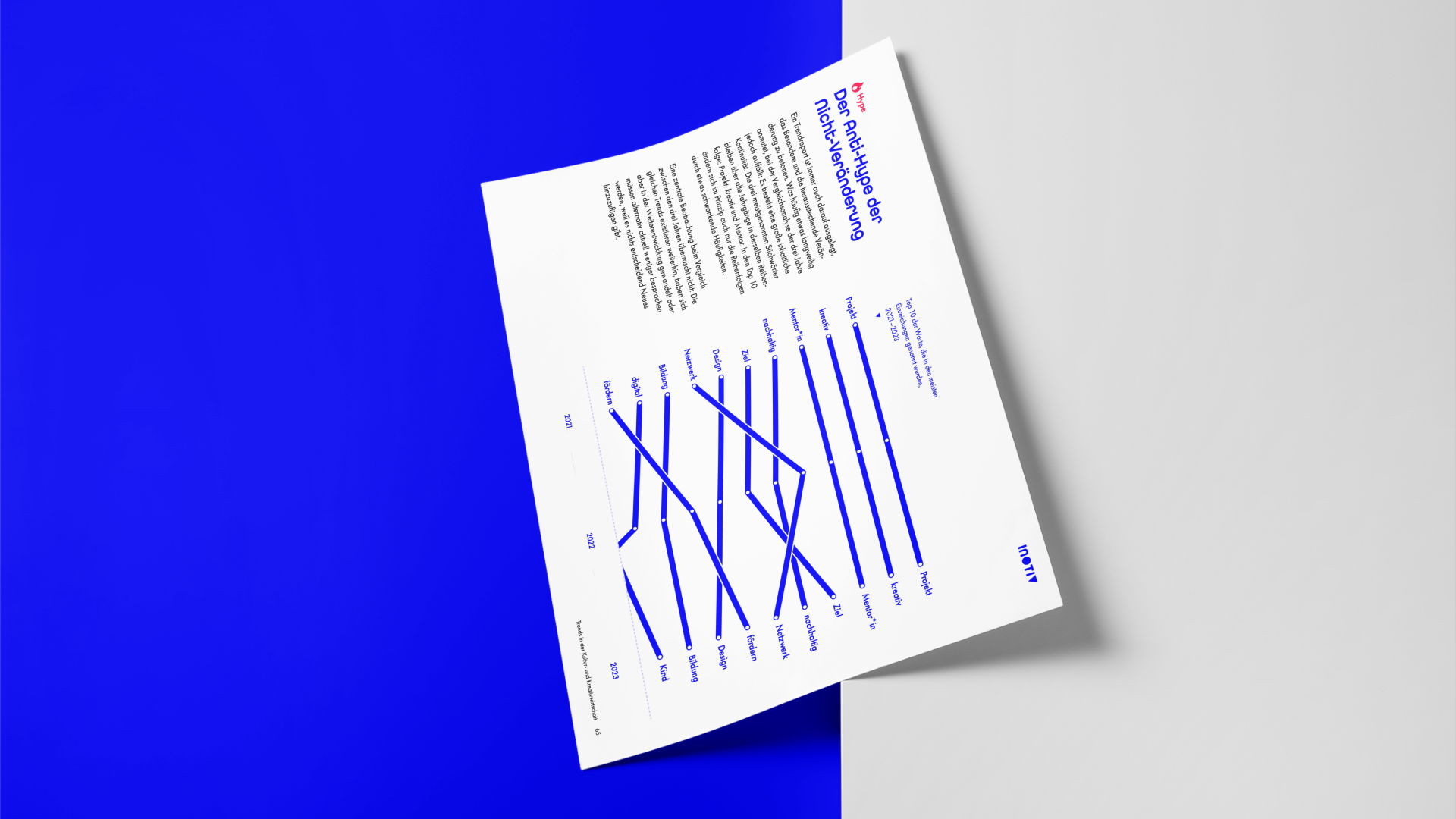
This allowed us to uncover relationships and create comprehensive data, which were then transformed into meaningful data visualizations and infographics. In addition, we took on the design of the entire layout of the report, providing a clear and informative overview of the current trends in business ideas.

The infographic features blue ellipses interconnected by lines, each encapsulating distinct elements of the dataset. These ellipses are arranged in horizontal clusters, with red text annotations providing additional context or categorization. The intricate network of ellipses and lines signifies the complex relationships uncovered in the dataset, transforming extensive data into meaningful visualizations.
The image displays a flowchart outlining the various stages in the analysis of the dataset and the visualization of the data. The key steps include keyword search, its enrichment, and the visualization of the found frequencies. From this, trends were then derived.