The website "Trade Briefs" shows a data visualisations of a world map, color-coded to represent different regions, provides a global overview of trade data.

Trade Briefs

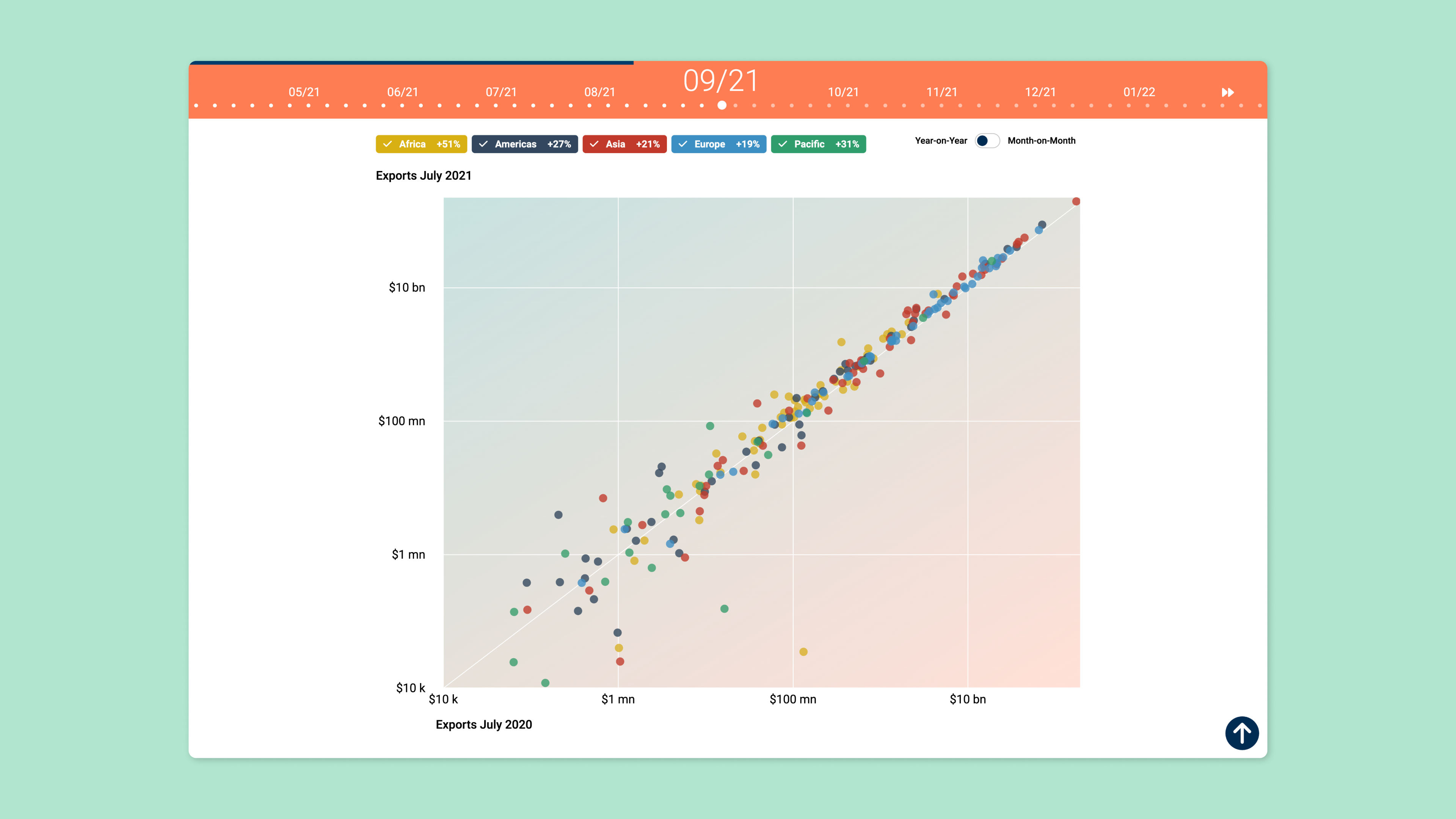
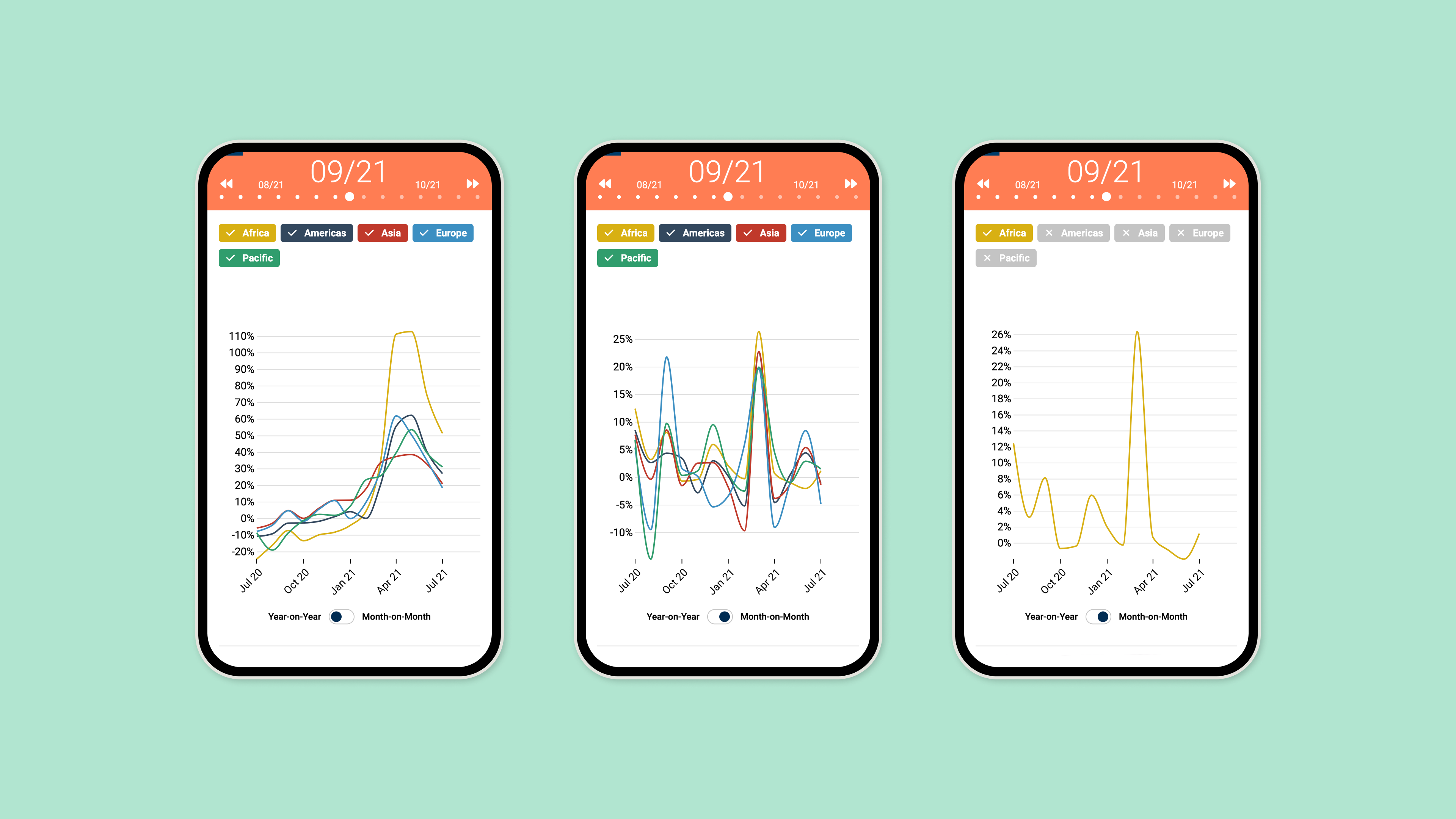
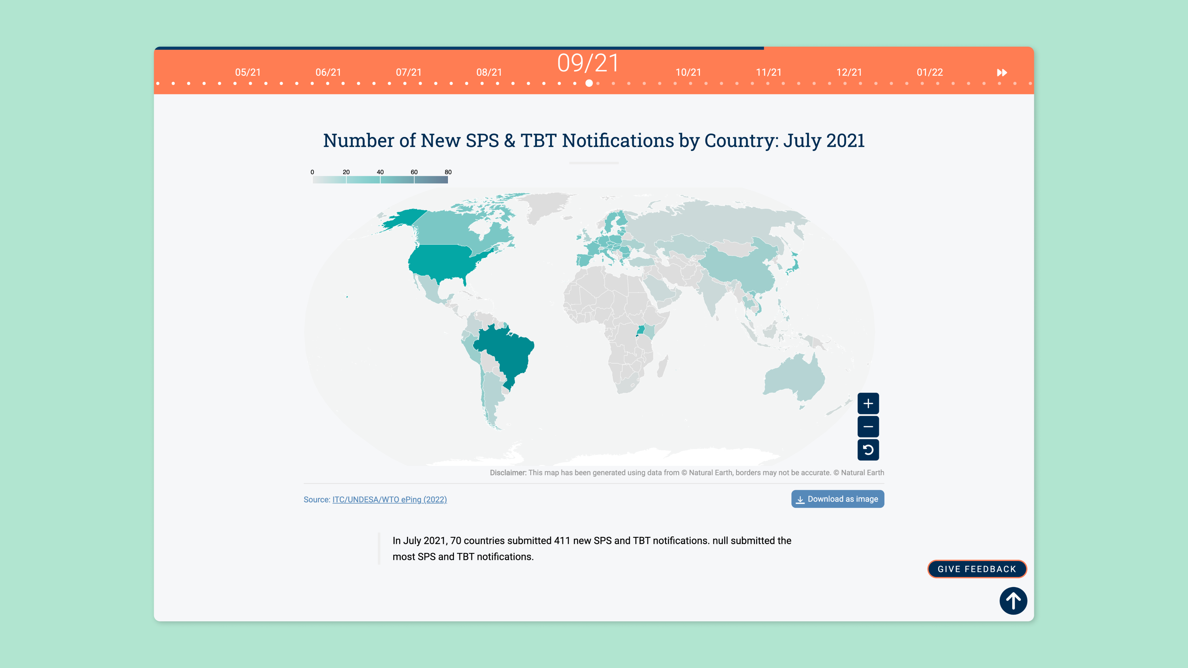
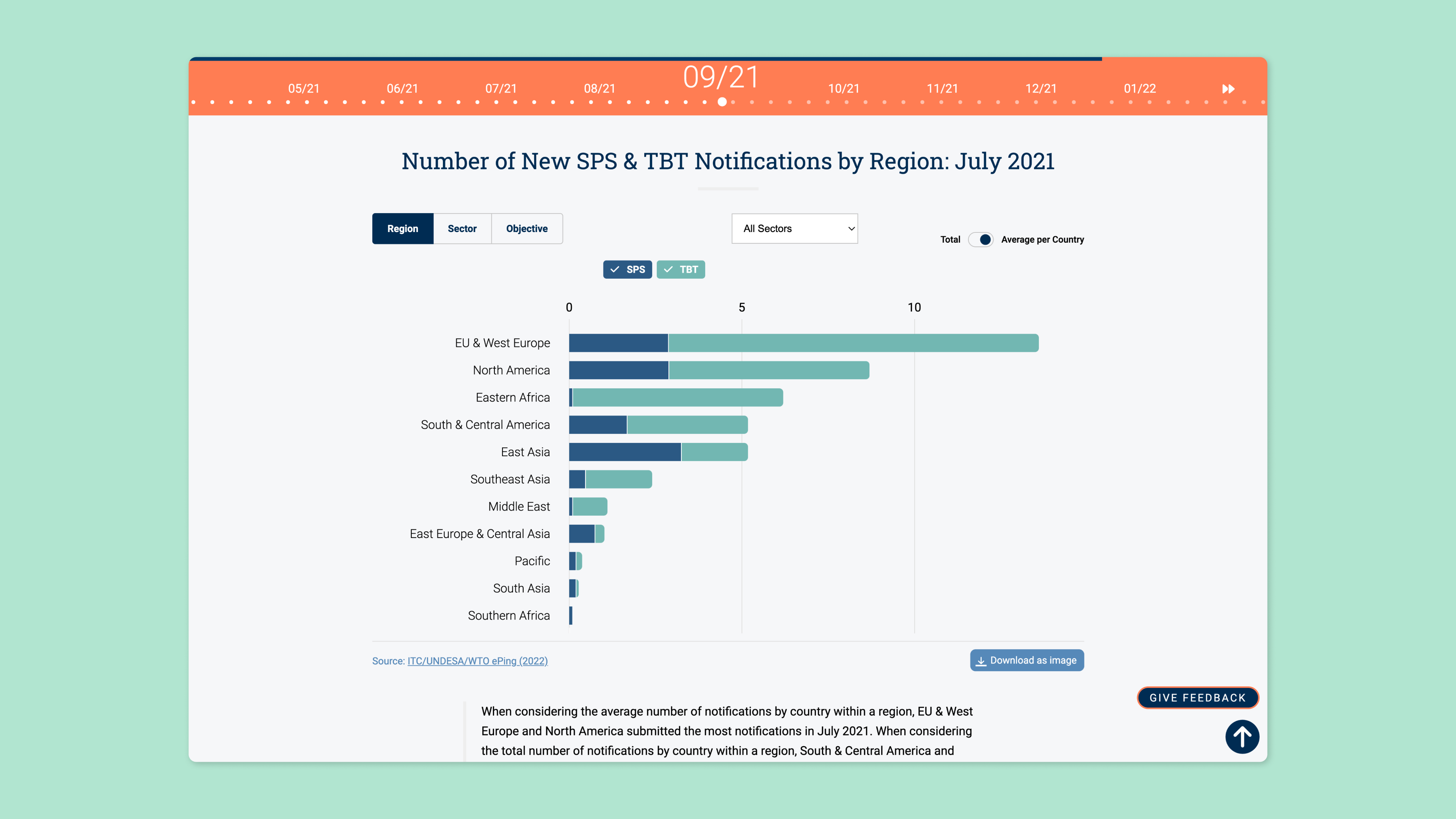
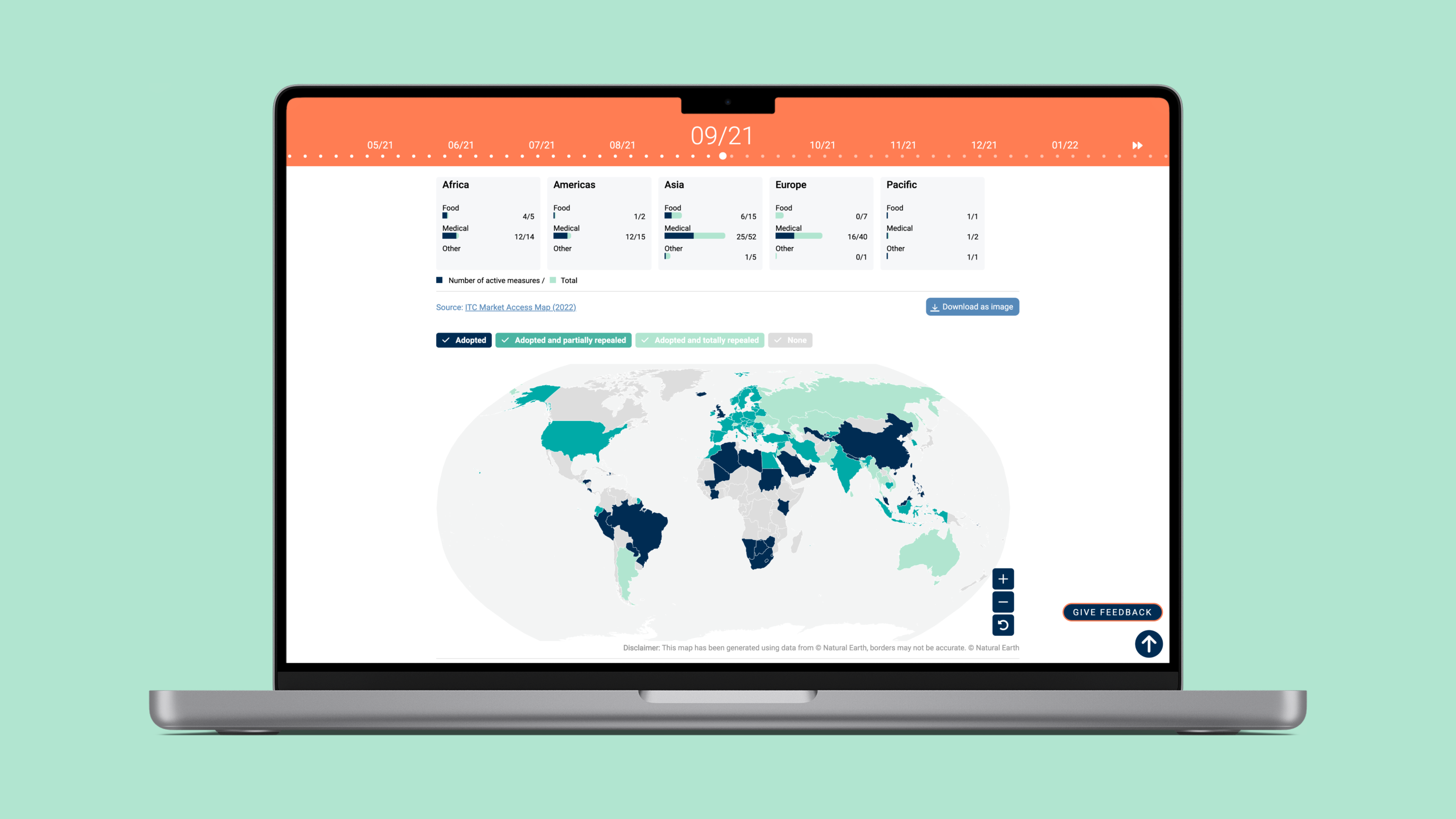
The International Trade Centre provides monthly updates to business and political leaders on the current state of world trade, publishing large amounts of data. With our assistance, these complex data sets were transformed into clear, attractive, and intuitive web representations. We conceptualized data visualizations, dashboards, and the overall appearance of the Trade Briefs.

Project features:

  • Report
  • Trade
  • Dashboard
Show AppTrade Briefs
A scatter plot graph from the comparing the exports from July 2021 and the exports July from 2020, for all continents. Each dot represents a data point and its color shows which continent it represents.
Smartphone screens showing curve graphics for the export values
A world map, color-coded to represent the number of new SPS & TBT notifications by country for July 2021.
Bar chart graphic showing the number of notifications the different parts of the world received in July 2021